Guitaraficionado74
Active Member
- Joined
- Aug 16, 2022
- Messages
- 118
- Reaction score
- 205
Hi guys,
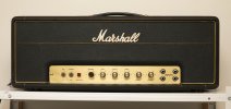
Like many of you, I suppose, I'm stuck with a vintage head missing its original badge/logo. Mine is a model 1987 from October 1969. It came with a modern day official Marshall 6" script logo. But as you know, that looks way too white and clean! So I took to some experimenting. (I could afford to mess up, because I was so foolish to already order an extremely expensive gold logo from those guys in London, that's another story).
So, first I tried the 'coffee'-mix. Doesn't do jack sh*t on the modern plastics... Onto other methods: I 'painted' the logo in a light Beige, with a POSCA-marker (Posca.com color number 45). That takes care of the 'too white' plastic. I wiped off the excess paint, letting the original white plastic shine through again. Then I darkened the inner cavities of the lettering with some brown shoe polish. On afterthought I think this was a little too reddish, but OK. To rough-up the entire surface of the logo, I buried it in some mortar mix, scraping the logo against the sand/grains. This gives the plastic a nice vintage looking surface. I rinced everything with water, and rubbed some parts of the plastic with fine steel-wool (scraping off excess paint etc). Ready! I think it looks a whole lot better now") The logo broke in the process, but hey, now it's even more 'period correct' ;-)
The logo broke in the process, but hey, now it's even more 'period correct' ;-)
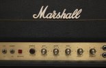
(Question for the historians here: should this amp from late 1969 have a gold logo, or a white one? Knowing Marshall I think it depended on whatever was lying around the shop, but do let me know what you think!).
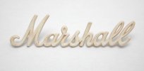
Like many of you, I suppose, I'm stuck with a vintage head missing its original badge/logo. Mine is a model 1987 from October 1969. It came with a modern day official Marshall 6" script logo. But as you know, that looks way too white and clean! So I took to some experimenting. (I could afford to mess up, because I was so foolish to already order an extremely expensive gold logo from those guys in London, that's another story).
So, first I tried the 'coffee'-mix. Doesn't do jack sh*t on the modern plastics... Onto other methods: I 'painted' the logo in a light Beige, with a POSCA-marker (Posca.com color number 45). That takes care of the 'too white' plastic. I wiped off the excess paint, letting the original white plastic shine through again. Then I darkened the inner cavities of the lettering with some brown shoe polish. On afterthought I think this was a little too reddish, but OK. To rough-up the entire surface of the logo, I buried it in some mortar mix, scraping the logo against the sand/grains. This gives the plastic a nice vintage looking surface. I rinced everything with water, and rubbed some parts of the plastic with fine steel-wool (scraping off excess paint etc). Ready! I think it looks a whole lot better now
The logo broke in the process, but hey, now it's even more 'period correct' ;-)(Question for the historians here: should this amp from late 1969 have a gold logo, or a white one? Knowing Marshall I think it depended on whatever was lying around the shop, but do let me know what you think!).